Ensuring that the website can function across all these devices is crucial. Web device testing examines how effectively your website performs on a mobile while ensuring that the users have a positive experience. Comprehensive testing finds problems early to improve website usability and search engine ranking to cover responsive design, accessibility, performance, and browser compatibility.
In this blog, let us explore the importance of web device testing, its various types, strategies for effective implementation, and essential tools. Whether you’re a developer, QA professional, or business owner, understanding and implementing these best practices will optimize your website and ensure it meets diverse needs.
What is Web Device Testing?
Web device testing checks how well a website works on different devices and browsers. This makes sure users have a good experience no matter what device they use.
It involves automated tools and manual testing practices to cover various scenarios and potential issues. Developers can identify and fix issues early by testing websites across different devices and environments.
Why is Web Device Testing Crucial?
Web device testing is crucial for several reasons that directly impact the usability and success of websites:
Ensures the website provides an efficient interface across all devices to automatically fit the size and orientation of each device.
Verifies that the website meets usability standards for disabled individuals to ensure all users can easily access and use the site.
Checks loading times and responsiveness across devices and browsers to ensure fast load times and smooth performance.
Confirms the website functions correctly across different devices, operating systems, and browsers to prevent display and functionality issues.
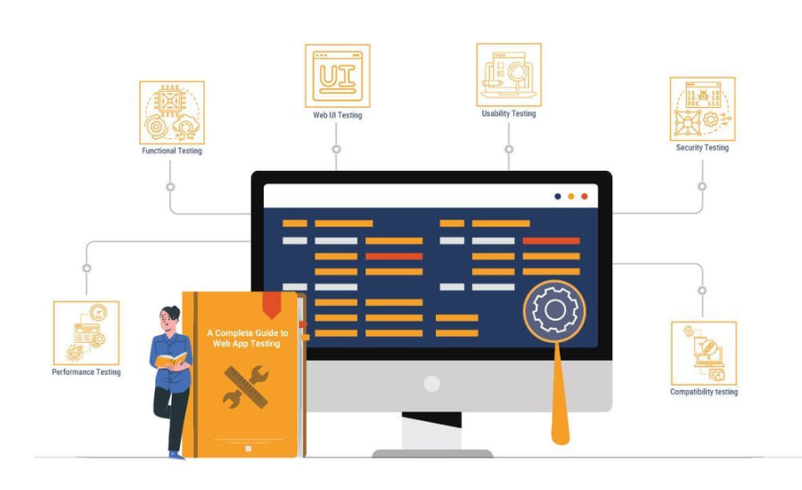
Types of Web Device Testing
Web device testing includes different tests to make sure websites work well on various devices, browsers, and operating systems. Let’s explore each type.
Responsive Testing
Ensures designs work effectively on different screen sizes and orientations.
- Viewport Adjustments: Resizes content based on screen size.
- Media Queries: Verifies CSS adapts styles correctly.
- User Interface: Checks navigational elements are accessible on all devices.
- Tools: Browser developer tools, emulators, real devices.
Cross-Browser Testing
Focuses on compatibility across different browsers.
- Rendering Consistency: Ensures website displays uniformly.
- CSS Compatibility: Verifies CSS styles are correct.
- JavaScript Functionality: Confirms scripts work as expected.
- Browser-Specific Issues: Identifies browser-specific bugs.
Cross-Device Testing
Checks website performance on various device types.
- Hardware Compatibility: Tests on devices with different specs.
- Touch and Mouse Interactions: Ensures responsiveness on touch and mouse inputs.
- Performance: Evaluates load times and responsiveness.
Performance Testing
Verifies website speed and behavior under different conditions.
- Load Time Analysis: Measures load times across devices and networks.
- Resource Utilization: Evaluates efficiency in managing resources.
- Scalability: Tests performance under varying traffic loads.
- Mobile Performance: Ensures good performance on mobile devices.
Accessibility Testing
Ensures the website is usable by individuals with disabilities.
- Assistive Technologies: Confirms compatibility with screen readers.
- Keyboard Navigation: Ensures all elements are accessible via keyboard.
- Color Contrast: Checks readability of text and images.
- Alt Text: Verifies descriptive alt text for images.
- Forms Accessibility: Ensures forms are accessible to all users.
Usability Testing
Assesses overall user experience across devices.
- Text Adaptation: Ensures text readability on different screens.
- Functional Components: Verifies intended interactions.
- User Feedback: Gathers data on user satisfaction and error patterns.
Strategies for Effective Web Device Testing
Here are key strategies to implement for successful web device testing to ensure the website works well on different devices:
Define Test Scope
Defining the test scope involves identifying critical pages and functionalities that require testing. This helps prioritize testing efforts and ensures that resources are allocated efficiently.
Focus on pages that are frequently accessed by users or contain essential functionalities.
Prioritize testing of critical functionalities such as forms, navigation, search, and interactive elements.
Test the entire path users take to make sure everything works well from beginning to end.
Focus testing efforts on the most important parts of the website’s function and user experience.
Create a Device Matrix
A device matrix lists the devices, browsers, and operating systems that need to be tested. This ensures comprehensive coverage across different user environments.
Prioritize Testing
Prioritizing testing involves focusing on the most popular devices and browsers used by your target audience. This makes sure resources are used well and problems that affect many users are fixed quickly.
- Use analytics to identify devices and browsers that are used by your website visitors.
- Prioritize devices and browsers that users have reported issues with.
- Stay updated with market trends and device/browser usage statistics to inform prioritization.
Automation and Manual Testing
Websites are ensured to function well and be user-friendly on various devices and platforms through manual and automation testing.
Automated Testing:
Automates repetitive tests, regression testing, and tests that require multiple iterations.
Executes tests faster than manual testing to provide quick feedback on potential issues.
Ensures consistent test execution and results to reduce human error.
Manual Testing:
It allows testers to explore and evaluate the website’s usability and user experience.
Tests scenarios that are difficult to automate or require human judgment.
Assesses visual appearance, layout, and user interactions.
Use automated testing for routine tasks regression testing and manual testing for exploratory testing and user experience evaluation.
Utilize Cloud Testing Platforms
Cloud platforms provide on-demand testing environments that can simulate various devices, browsers, and network conditions. They offer the following advantages:
- Easily scale testing resources up or down based on demand.
- Access testing environments from anywhere with an internet connection.
- Pay only for the resources used to reduce infrastructure costs.
- Simulate real-world conditions such as different network speeds and geographical locations.
LambdaTest is an AI-powered platform for orchestrating and executing tests, enabling you to perform both manual and automated testing on a large scale. With access to over 3000 real devices, browsers, and operating system combinations, LambdaTest provides a robust and scalable environment for testing your websites and web applications.
Key features of LambdaTest include:
- Real-time testing for both mobile and desktop devices.
- Capability to run automated and manual tests across different browsers.
- Direct bug and issue capturing during the testing process.
- Identification of layout issues, functionality glitches, and performance variations due to different platform renderings.
- Interactive testing that allows real-time user interactions and screenshot testing to spot visual differences across various environments.
Continuous Testing
Including testing in the continuous integration and continuous deployment process ensures that automated checks are regularly performed during the development cycle.
- Integrate automated tests into the pipeline to run tests automatically with each build.
- Identifies issues early in the development cycle to reduce the cost and effort of fixing issues.
- Provides immediate feedback to developers to address issues quickly.
Tools for Web Device Testing
Several tools are available for web device testing each catering to different aspects of testing and optimization. These tools ensure websites perform well across different devices, browsers, and scenarios. Here are some of the common tools.
Browser Developer Tools
- Chrome DevTools: These are tools inside the Google Chrome browser. They let you look at and change HTML and CSS see how fast your website works, and find problems with JavaScript.
- Firefox Developer Tools: Tools in Firefox for looking at HTML, CSS, and JavaScript. They help you see how your website works and find mistakes.
- Safari Web Inspector: Tools in Safari for looking at web pages to inspect how fast they work and testing on different devices.
These tools are crucial for debugging and optimizing web pages to make immediate changes and see the effects directly in the browser.
Automated Testing Tools
- Selenium: A tool that can automate web browsers. It supports many programming languages and helps check if web apps work the same in different browsers.
- Cypress: A modern testing tool that’s fast and reliable. It’s easy to use for developers and has good features for debugging.
- Puppeteer: A tool that uses JavaScript to control Google Chrome. It can automate tests, copy information from websites, and make PDFs of web pages.
Automated testing tools streamline the testing process by executing repetitive tests, regression tests, and tests requiring multiple iterations to ensure consistency and reduce human error.
Performance Analysis Tools
- Lighthouse: An automated tool for improving the quality of web pages. It audits performance, accessibility, best practices, SEO, and more. Lighthouse runs in Chrome DevTools from the command line or as a Node module.
- WebPageTest: WebPageTest provides detailed insights into how quickly a web page loads and performs. It displays metrics such as the time to first paint and full page load.
- You can see this information from different places and on different web browsers.
These tools help identify performance issues to optimize loading speeds and overall performance which is crucial for enhancing user experience and SEO rankings.
Accessibility Testing Tools
- Axe: An accessibility testing engine for websites and applications. It integrates with various browsers and testing frameworks to identify accessibility issues and provide solutions for compliance with accessibility standards.
- Wave: An accessibility evaluation tool provided by WebAIM that helps developers ensure web content is accessible to all users. It also checks web pages for accessibility issues and offers suggestions for improvement.
- Lighthouse: Check for common accessibility issues on web pages and give you a score along with tips on how to fix them.
Best Practices for Web Device Testing
Web device testing can be optimized by following these best practices:
- Start testing on mobile devices to ensure the website works well in different environments. This ensures the reliability of smartphones and tablets.
- Test on real devices to accurately replicate real-world conditions such as touch responsiveness and hardware variations which can affect user experience.
- Implement automated tests to increase efficiency and accuracy for repetitive tasks and regression testing. Automation helps in identifying issues quickly and ensuring that new updates do not introduce unexpected problems.
- Test under realistic conditions such as varying network speeds, different battery levels, and concurrent usage of other apps. This approach provides insights into performance under typical user scenarios.
- Focus testing efforts on devices and browsers that are used by your target audience. Analyze analytics data to determine the most critical platforms to test.
- Regularly update your list of devices and browsers to reflect market trends and user preferences. This ensures that you are testing on platforms that are relevant to your users.
- Document all tests, findings, and fixes comprehensively. This documentation is used as a reference for future testing and issue resolution tracking.
Conclusion
In conclusion, testing websites on various devices, browsers, and operating systems is crucial. Thorough testing ensures the site meets user expectations and business goals as technology evolves.
Developers and QA teams can find and fix issues early by using effective testing methods like checking how websites adjust to different screen sizes and testing across various browsers and devices. Tools such as Selenium automate testing and tools like Lighthouse test improve how websites function and make testing easier.
Testing website usability for people with disabilities ensures websites are useful and enjoyable for everyone. Integrating testing into the development process means that teams can get feedback quickly and make improvements to give people great web experiences every time.
Don’t miss the latest updates and alerts visit: Internal Insider!